Quaise Energy Africa
Renewable Power Project Developer

Quaise Energy Africa is a renewable power project developer committed to preserving the natural environment ecosystem and supporting the prosperity of climate-resilient economies and communities.
Quaise Energy Africa reached out to us to further develop its existing visual identity. This created an opportunity for us to work closely with the company's leadership team to understand their unique positioning in the energy industry and to further develop visual elements that align with their mission and values.
Quaise Energy Africa was selected to be featured in The Best Green Technology Branding Examples by DesignRush, a platform known for promoting best designs
Scope of work:
Logo suite (primary and secondary logos)
Typography
Color palette
Brand pattern
Marketing collateral
Social media templates
Company profile design
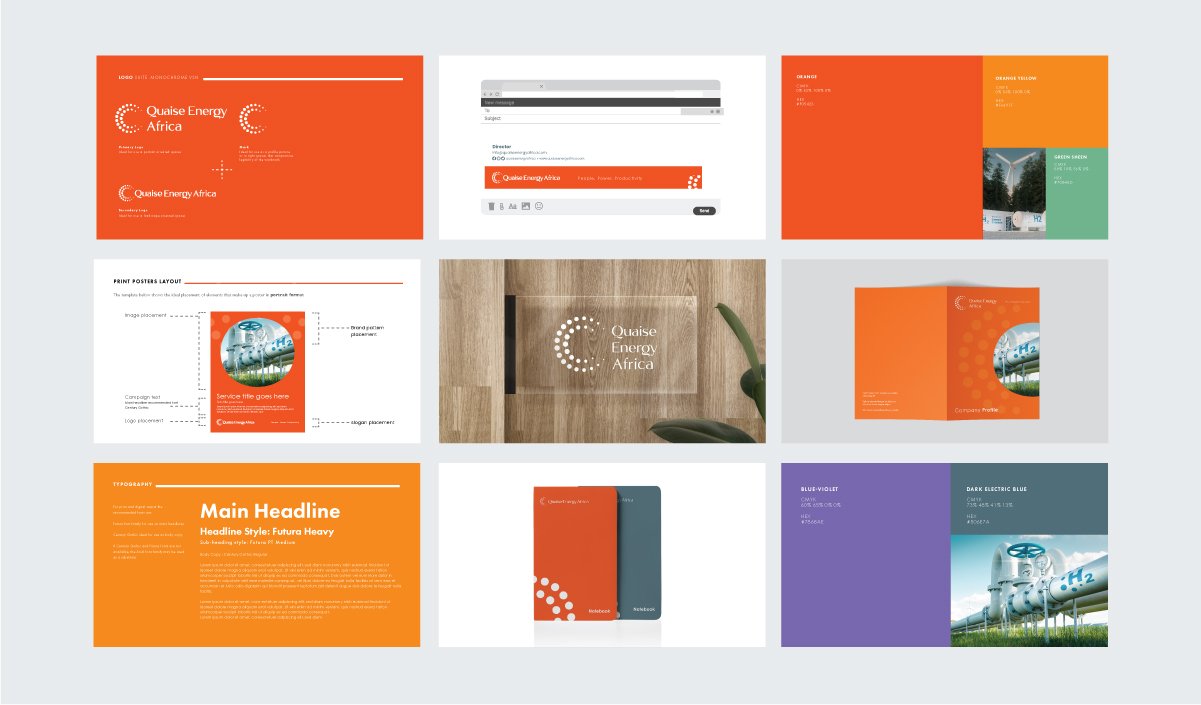
Brand Manual
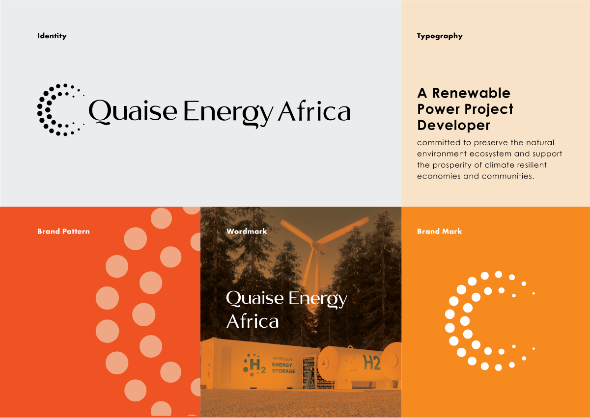
The visual identity system included a primary and secondary logo, color palette, typography, and a pattern that could be used across all of Quaise Energy Africa's marketing collateral.
The visual identity system we developed was a crucial element because it is tightly linked to the success of any branding and marketing strategy for Quaise Energy Africa.
It encompasses the visual elements that define a brand, such as the logo, color palette, typography, and graphic elements. A well-designed visual identity system creates a unique and recognizable visual representation of the brand, which helps establish a brand's personality, mission, and values in the minds of consumers. Consistency in the application of visual elements across all touchpoints, such as marketing materials, and digital platforms, creates a cohesive brand image, which builds brand recognition and trust with a company’s audience.

Stationery Design x Notebook Design
For the stationery design, we used the new visual identity system we had developed as a foundation. The primary logo was prominently featured on the business cards, letterhead, and notebooks, while the color palette and typography were consistently applied to maintain a cohesive brand image.
We also incorporated a subtle pattern that mirrored the graphic elements from the visual identity system, adding visual interest and depth to the stationery. By using the same design elements across all stationery items, we were able to create a consistent and recognizable brand image.
The resulting stationery design not only served practical purposes but also functioned as a marketing tool, reinforcing Quaise's position as an established renewable energy project developer.

Apparel Branding
We worked on apparel branding for Quaise Energy, which was an essential part of their overall brand identity. Our goal was to create apparel that was not only functional but also visually engaging.

Social media design
In addition to the physical collateral, zeti creative also developed social media page branding and social media templates that reflected Quaise Energy Africa's new visual identity. The social media templates helped Quaise Energy Africa to maintain a consistent brand image on its social media channels.

Instagram stories design
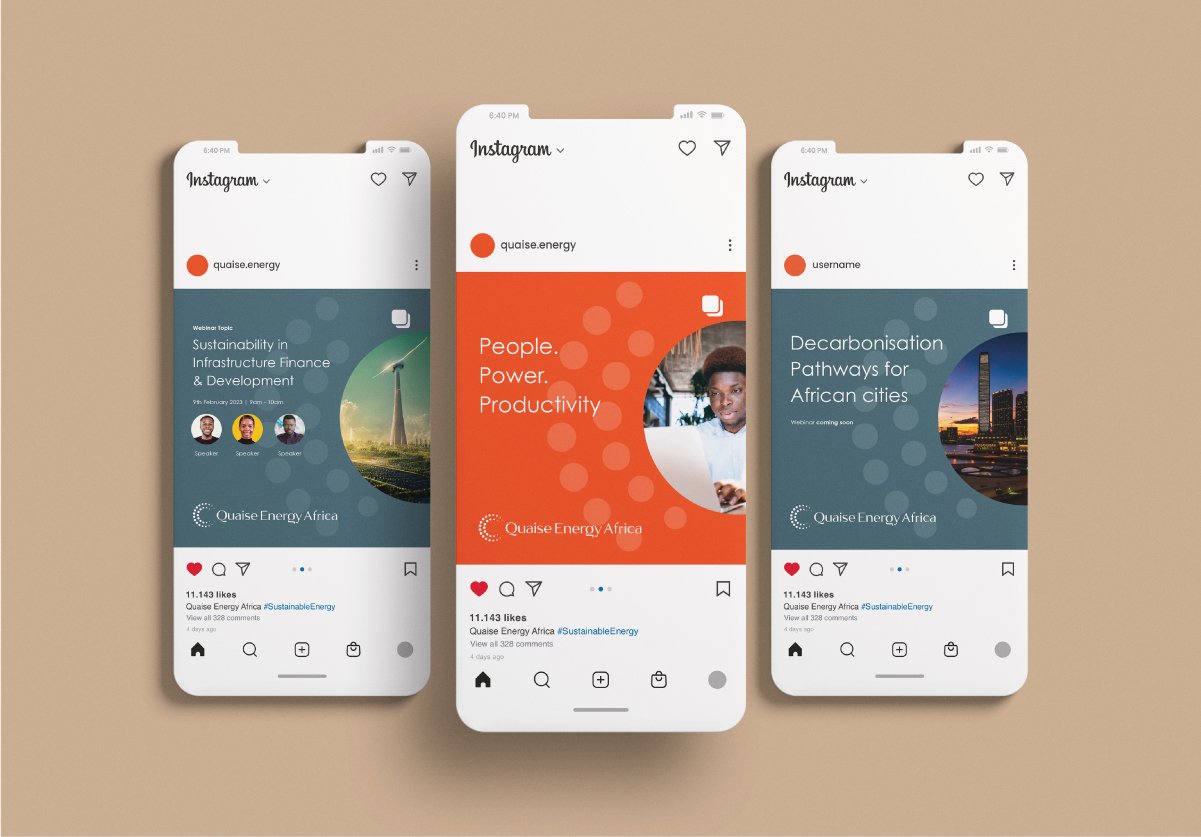
Social media design

Office Signage: Indoor
To further elevate Quaise Energy Africa's brand image, zeti creative also developed indoor signage for their office. The indoor signage was designed to reinforce Quaise Energy Africa's brand values and identity to anyone who visited their office.
We also designed Quaise Energy Africa's company profile based on the new visual identity system. We used the same color palette, typography, and graphic elements throughout the profile to ensure a cohesive brand image. By incorporating imagery and language that reinforced Quaise's commitment to renewable energy, we created a visually engaging and easy-to-read profile that accurately reflects the company's values and offerings. The resulting company profile now serves as a critical tool for Quaise to communicate its story and reinforce its position as an established renewable energy project developer in Africa.

Company profile design
Snapshot of the brand manual
Finally, we developed a brand manual that outlined how to use Quaise Energy Africa's new visual identity system correctly and consistently. The brand manual included guidelines on logo usage, typography, color palette, and other graphic elements. The brand manual will serve as a useful resource for Quaise Energy Africa to ensure that its brand image remains consistent across all touchpoints.
Overall, zeti creative's work with Quaise Energy Africa demonstrates the importance of a well-designed visual identity system for building a strong brand image. The new visual identity system will help Quaise Energy Africa to better communicate its values, stand out in a competitive market, and ultimately drive business growth.